Cover Regret, and Completely KERFLUMMOXED!
I feel like a see-saw. Some of you may remember my Cover Wars post. I had a really difficult time with the cover for Training Ground. My final cover was usable, my large FaceBook audience liked it… but there were things about it that bothered me. I thought it looked too cartoony, plus it’s blurry. Antonia looks very stiff, happily stiff, but stiff. And, the scene portrays their relationship and joy near the end of the book. It doesn’t have any of the feelings of where they started, their internal struggles that moved the plot forward, it’s too warm and cozy.
I have an artistic bent, so I started working harder to master the two programs I have for graphic arts (I collect programs, just saying). I used this cover as my challenge to see if I could get what I really want. I was very pleased with the results until I posted the two covers side by side on FaceBook and asked my audience their preference. Everyone, including some authors preferred the old cover! The artist within me quails!
Obi-wan-Kenobi, you’re my only hope!
Cover A
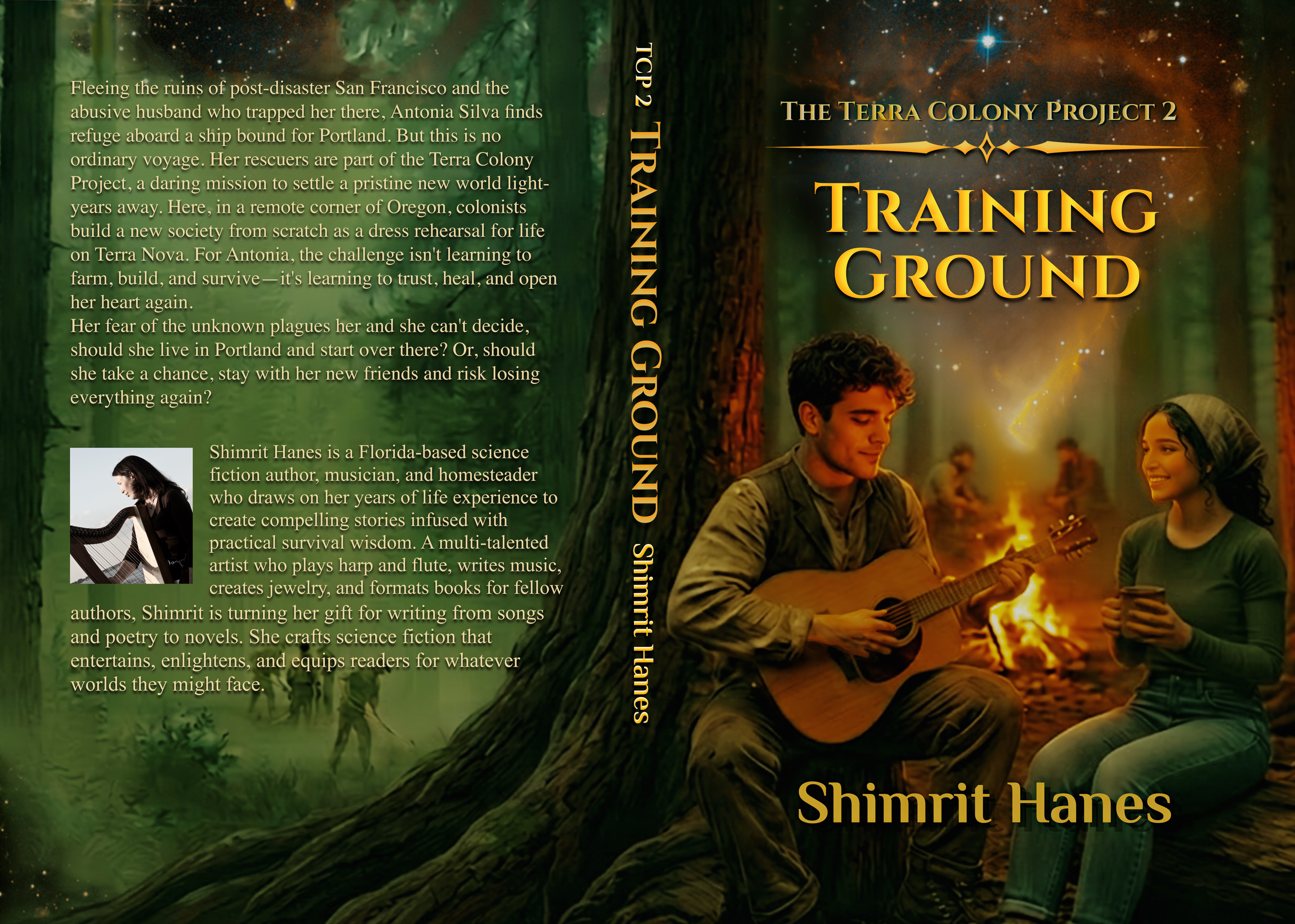
Cover B
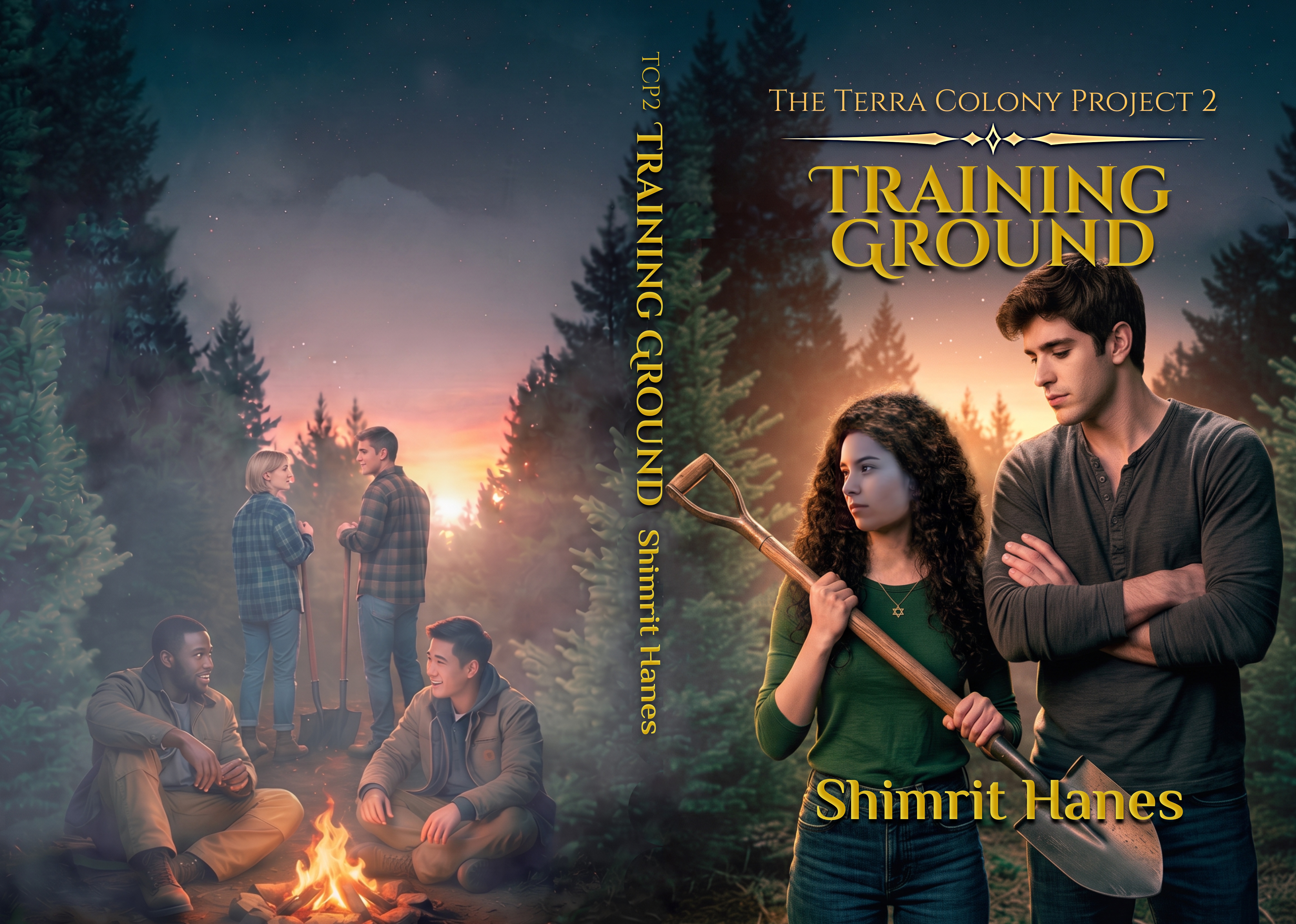
What do you think?