Book Cover Revision
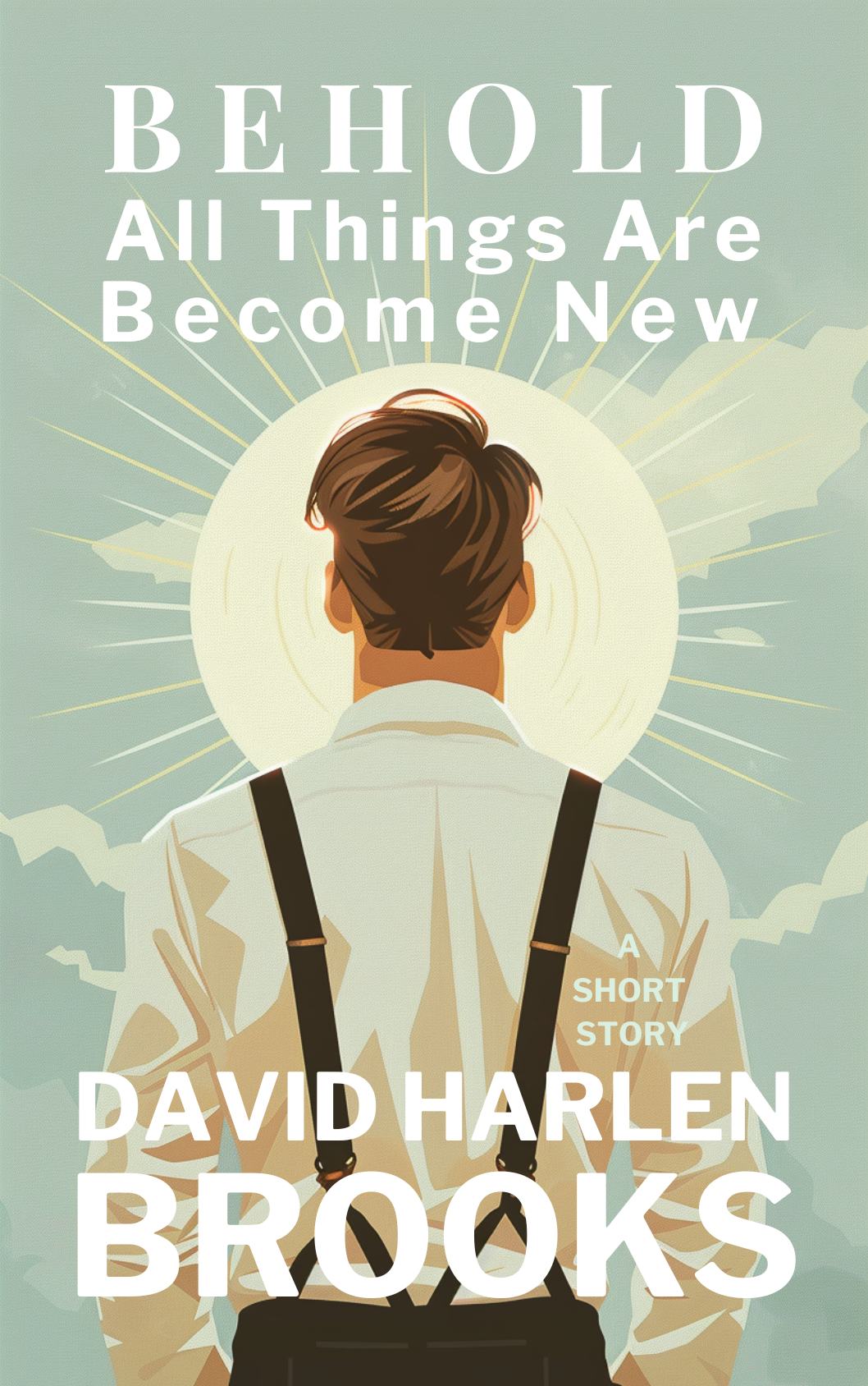
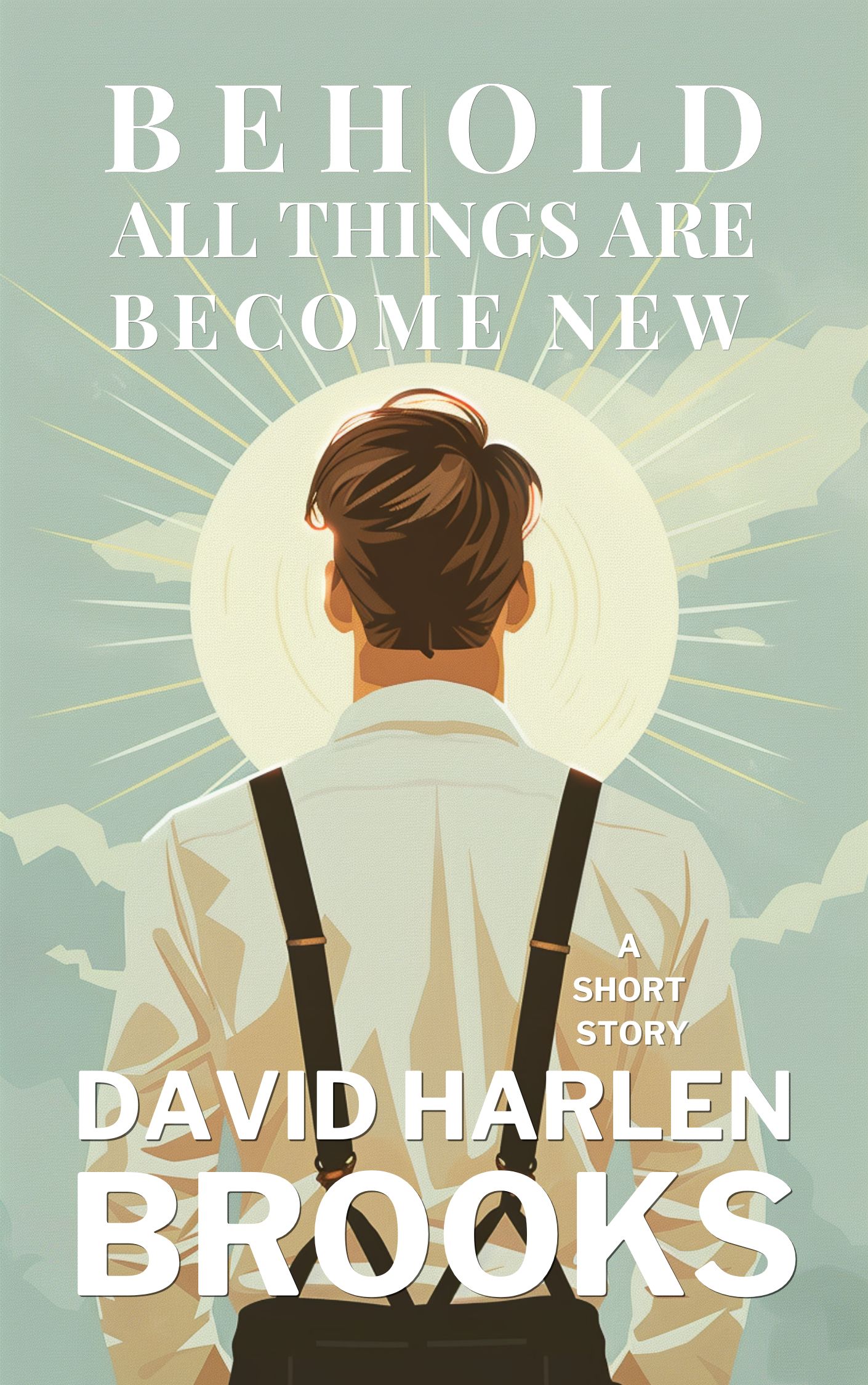
I made some minor revisions of the book cover options that I posted yesterday. Here is the original #1 which received more votes and #2 is the revision based on feedback. I put a slight shadow behind the text and changed the subtitle font to match the word BEHOLD. I also capitalized the subtitle to eliminate what might appear as awkward spacing to some. Any further thoughts? Thanks again.