I have a last call with my cover artist but I still feel like I'm missing something.
Bit discouraged right now.
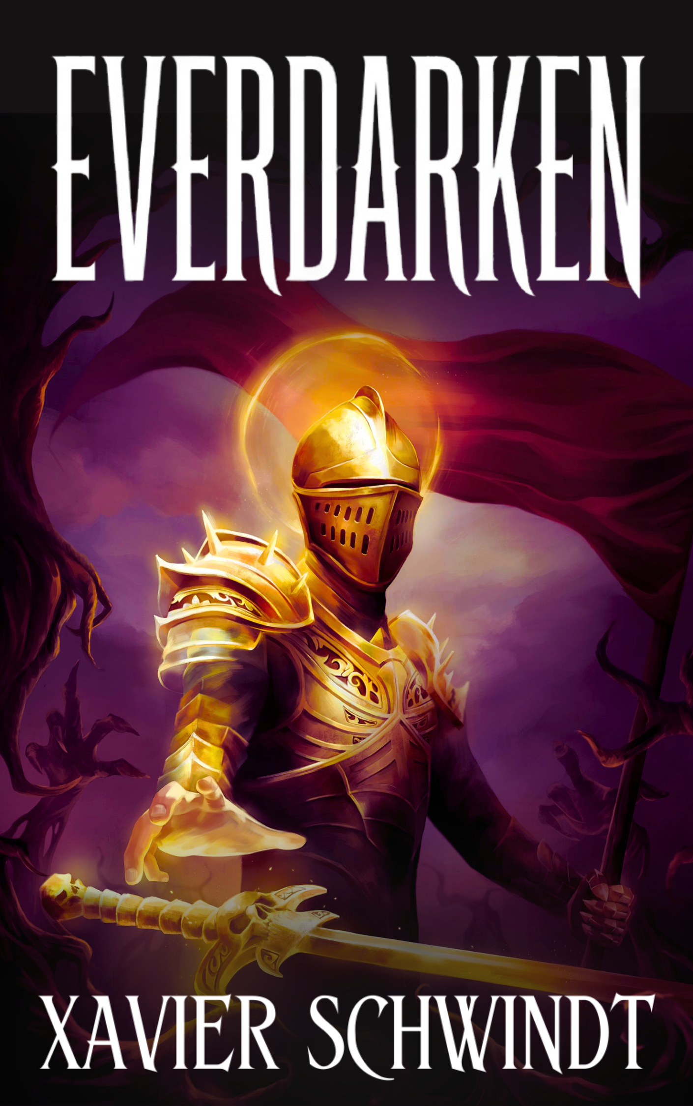
I am working on my cover for EverDarken (dark fantasy / epic fantasy) and I’m about to close out with my artist before I take over the typography and layout side myself, as well as handing it over to some designer from getcovers.com to mess around with.
I love the art so much but it just doesn’t seem to be working for some reason. Probably because I’ve spent all day in Canva looking at it.
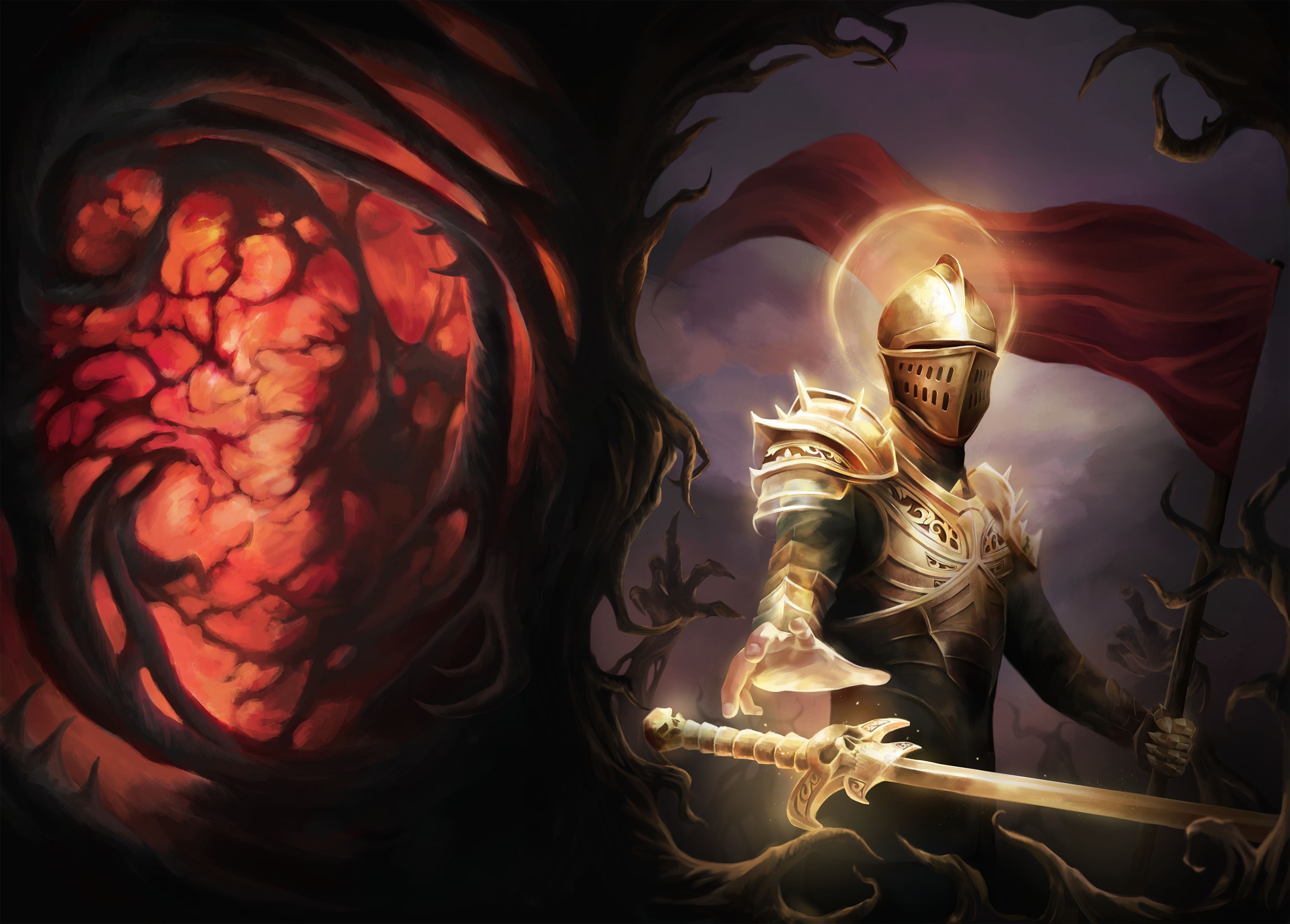
Looking at the raw art with fresh eyes is there anything you'd ask a designer to tweak at this stage for the genre? Stuff like color grading, contrast, atmosphere, anything that would help it read more "dark fantasy" on the kindle charts before I start layering type on top? I think I am going to ask to get rid of the halo as in the book cover analyser that keeps coming up as a slight turn off for my target reader.
Here’s the raw art and a rough junkie cover that I threw together myself:
genuinely open to honest feedback, still learning this side of publishing. Thank you guys in advance so much. Blessings!