Update on my book cover
I posted here a few weeks ago asking for feedback on my cover for Lies and Deception, the first book in my series The Rose In The Fire, and I received so much great helpful information. I am now working with a company called 100Covers and so far I’m really pleased with what they’ve done, but now I’ve hit a snag!
My books are fantasy/fairy tale/allegory and the former cover was amateurish and didn’t communicate the genre at all. Now my husband thinks the genre might be romantasy but I’m not sure. There is romance in the second book but fairy tales in general have a romantic nature. But because the series is about spiritual warfare there are aspects of horror as well.
So I said I wanted a dark cover with a central image of the rose in the fire, like I had on the original cover (which was not dark). I looked at many fantasy covers to see what would look like the genre. Here is what we ended up with:
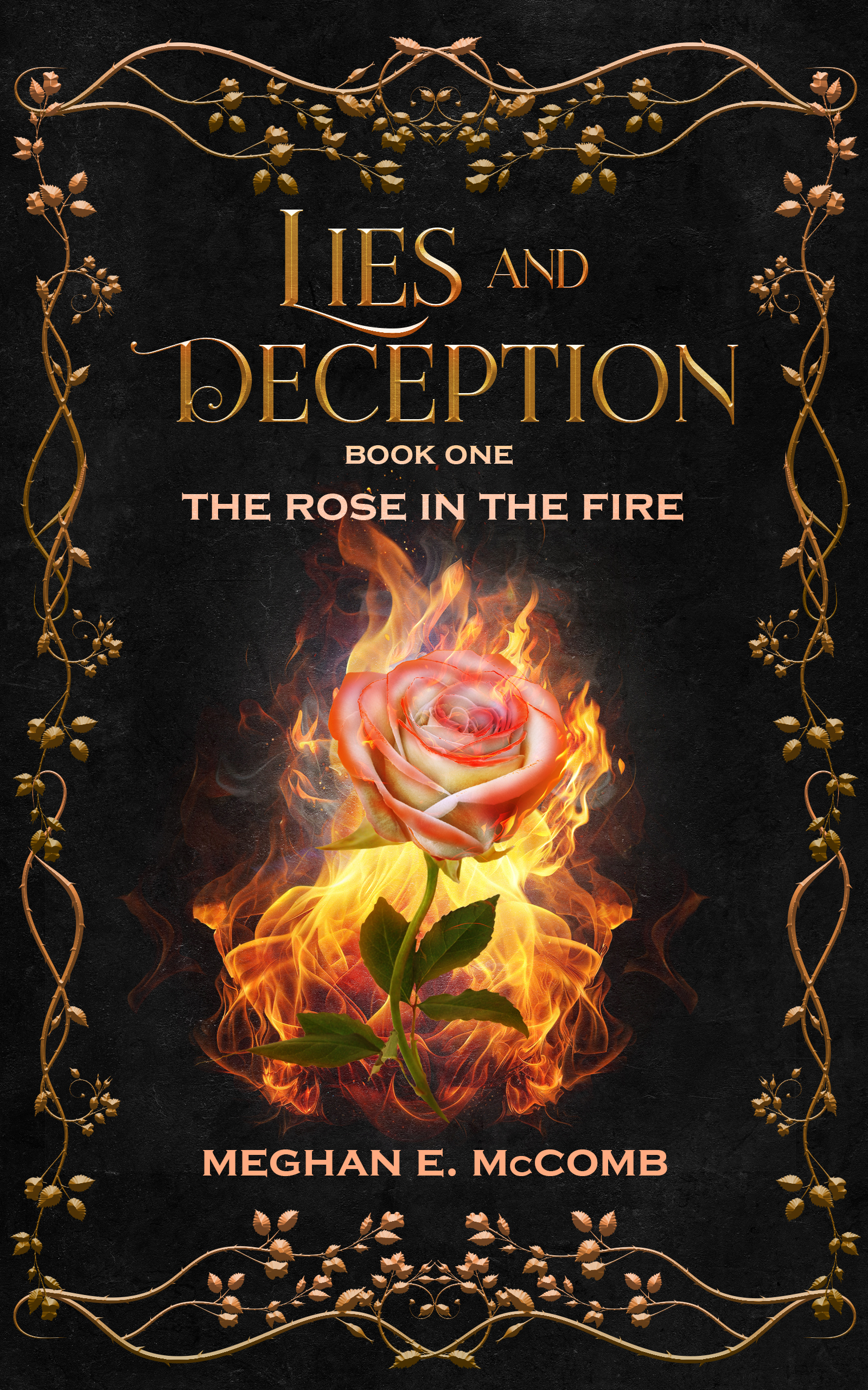
(Sorry, I don’t know why that is so huge! Don’t know how to shrink it.)
But then my son looked at it and suggested we remove the border to make the rose image stand out more. He sent me his updated image:

He has a point about emphasizing the rose but I think this is kind of barren looking. All the fantasy covers I looked at on Amazon were pretty elaborate and the ones I liked best had gold borders. Also, one person said the border made it look old fashioned and the story takes place in horse-and-buggy days with long dresses and all.
What do you all think? First of all, let me know your general thoughts on this cover idea — will it work well? Does it communicate the genre? Can it compete with similar covers in fantasy? And should I keep the border? Thank you!