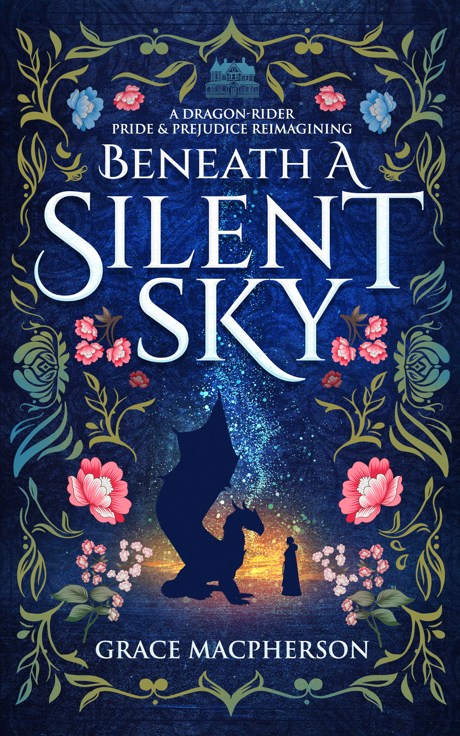
Advice on cover... Round 2!
First off, thank you to everyone who gave advice on my previous post about cover design issues! I am much happier with the direction the cover is going now, but would welcome any feedback as the designer makes final changes.
For some context, the story is a dragon-rider Pride and Prejudice reimagining—fairly short, strong romantic subplot, and with some action but lots of cozy vibes. You can read the blurb here.
I like the nods to historical romance and cozy fantasy in this overall design, as well as the incorporation of the dragon-and-girl motif. I also like the navy background with mostly cool colors.
However, the cover feels a little busy to me, especially because of the combination of the night sky with the dragon/girl silhouette and the floral border… I like both, but it feels like a little too much. I’m wondering if simplifying the background to a solid color (while keeping the silhouette) would help with that. Changing the floral/leaf boarder to a single color (or at least removing the pink and/or blue roses) would also probably help.
Thanks for any thoughts anyone has on this!