Cover feedback
I am just not loving this cover, and I’m not quite sure why…. Does anyone have tips for revisions that I can pass on to the designer?
The genre is YA Christian fantasy with a strong romantic subplot; blurb is below the cover. I think part of what I’m disliking is the use of stock photos instead of an illustrated style, but that’s kind of how it goes with a budget design (100Covers).

Blurb:
Ever since her parents’ deaths, Elizabeth Owens has has one priority: taking care of her sisters. With the help of her dragon, Scar, and the Scavengers Guild, she’s been managing just fine on her own.
But when an attack from dragon-riding pirates forces the Scavengers Guild to shut down, Lizzy accepts a job working for the imperial dracony to spy on the pirates. As she works to uncover the identity of their charismatic captain, Lizzy begins to wonder if she’s fighting for the right side after all—especially when her growing friendship with a mysterious pirate begins to hamper her progress.
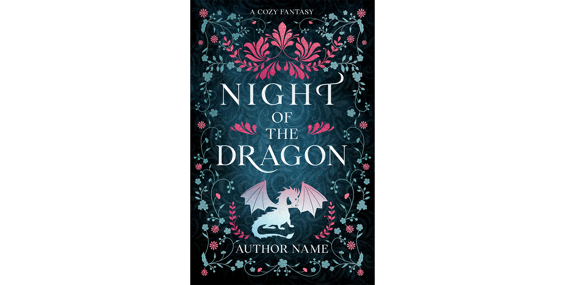
Editing to add: does anyone have thoughts on a more symbol-based cover like the one below? I might try going that direction instead of where I was trying to go before. (I think symbol based covers are more prevalent in this subgenre anyway, although it was about a 60/40 split when I looked.)