Print Cover feedback
Hi all, sharing my print cover below for feedback and to get answers on a few specific questions.
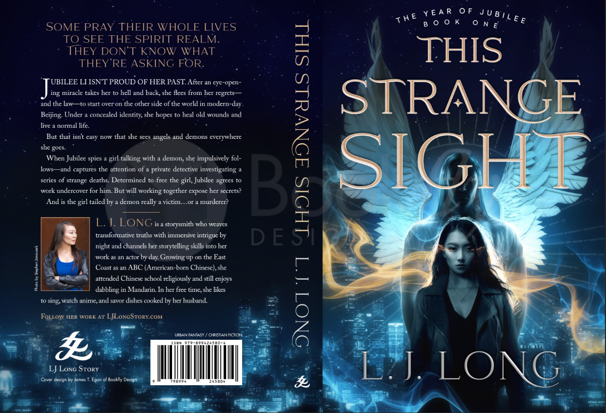
First off, the front cover (right side) is already finalized. I just need to finalize the back cover design now. Here are the final tweaks I’m considering and my questions:
1) Should I keep the genre categories, “Urban Fantasy / Christian Fiction,” there above the barcode—or change them, or remove them completely? I browsed B&N recently and didn’t see these exact genre tags. Instead, I found a lot of simply “FICTION” (in the Fantasy aisle), and things like “FICTION / Christian” or “FICTION / Christian / Suspense” (in the Religion aisle where Christian fiction was). Other aisles sometimes had tags like MYSTERY, which this doesn’t technically fall under, and there was the occasional FANTASY or FICTION / FANTASY. What do you guys think…should I try to emulate the kind of tags found in stores? Do specific genre tags like mine hurt or help me? (FYI I am planning to release on Amazon — no concrete plans to go wide yet but that’s something I’d want to leave the door open for in the future.)
2) I think the ISBN code, along with the logo and imprint name, can both be closer to the bottom (and maybe to the sides too, so that there’s less margin on the sides and more separation between the two in the middle?), thereby giving more space for…
3) More spacing between paragraphs & lines in the summary. I feel like my typed-out draft of the blurb had slightly more dramatic impact because of the clear spaces I had between the top two sentences (in large gold font here), and also the space before the final sentence.
4) Maybe smaller text for the author bio? It looks huge.
Open to any other feedback too! Thanks guys.